In his Conceptual Cartography course, CMU School of Architecture associate studio professor and practicing architect Jonathan Kline prompts his students to break into small groups to roll dice, spin tops, blindfold each other, and tie lengths of yarn around pins studded on a paper map. Using random generation processes to create spontaneous geographic journeys, Kline’s students uncover previously unnoticed—but relevant—aspects of the urban experience. It’s all about the dérive, or “drift,” the psychogeographic practice of traveling through the city without the use of conscious decision-making. As one exercise in the toolkit of mid-century French collective the Situationist International, a school of avant-garde Marxist theorists and provocateurs who used proto-forms of culture jamming to challenge what Guy DeBord described as The Society of the Spectacle, the practice of dérive intends to reinvent our relationship with the built environment.
But reinventing cartography doesn’t have to require blindfolds and berets. “We make maps all the time that are meant to abstract and isolate certain aspects of the city in order to emphasize that aspect, to make it more apparent,” Kline says. “The point of abstracting the built environment, collecting random data sets, often with a playful attitude, isn’t to be obscure or pretentious; it’s to break preconceptions and see the city in a different way.”
This kind of reenvisioning was the central theme of city planner and urban theorist Kevin Lynch’s 1960 book The Image of the City. In this slim text, Lynch set about breaking down our built environments into discrete, constituent parts: Paths, edges, districts, nooks, and landmarks became the elements that explained not just the construction of the city physically, but the abstract idea of how people inhabit, move around in, and conceive of their cities. “We must learn to see the hidden forms in the vast sprawl,” Lynch wrote.
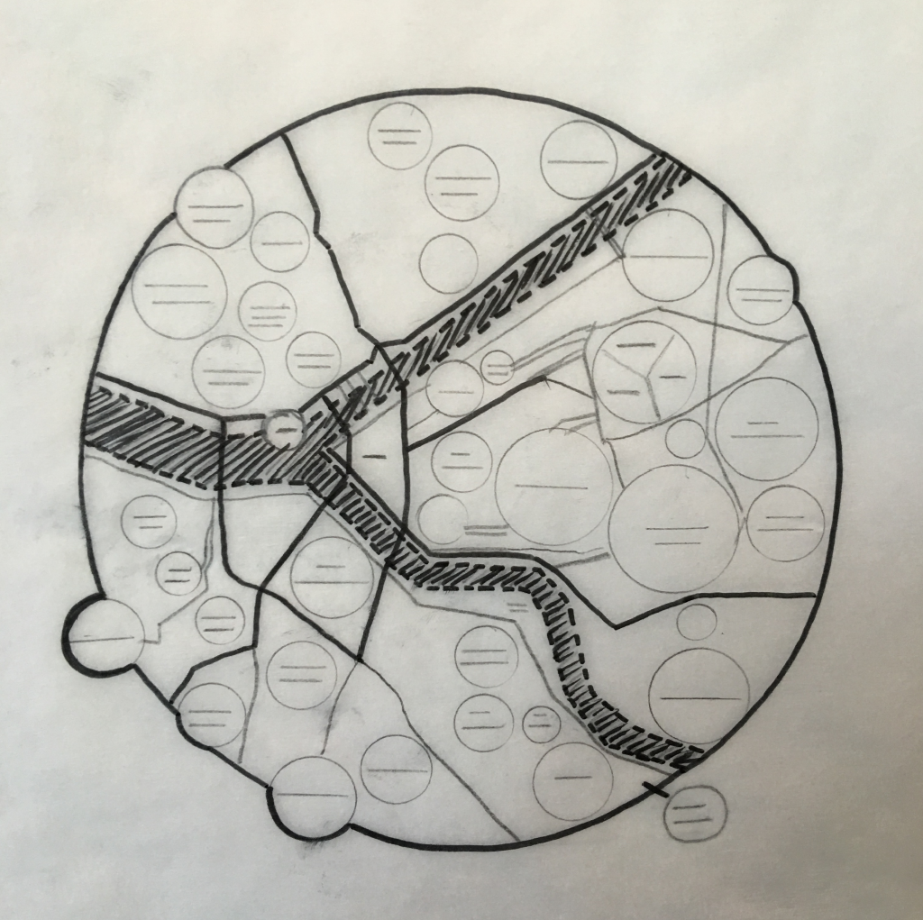
This kind of urban reimagining inspired designer and inventor Archie Archambault, who lives in Portland, OR and Brooklyn, NY, to undertake his mind mapping project. After several years and dozens of maps—from Buenos Aires and Seattle to Nashville and Paris, plus some fun projects like the human heart and Dante’s levels of hell—Archambault prepared to take on the city of Pittsburgh. Enlisting designer Lena Tesone, a Pittsburgh native and CMU alum, their collaborative process of mapping Pittsburgh turned out to be the hardest of them all, Archambault shared. Read our lightly edited conversation below.
![]()
Adam Shuck: How did your project start? What inspired you?
Archie Archambault: I was really inspired by a design theorist named Kevin Lynch, who developed criteria for cities, for how you would construct the idea of a place in your head, called Image of the City. He basically breaks up the different elements, like edges, or paths, that form an image in your head of how a city’s organized.
And I was just messing around one day in Portland trying to explain to myself how the whole thing works, because I was new, and I came up with this diagrammatic way of thinking about it that people really responded to. I then quickly moved on to Amsterdam and made that one.
This was all right before smartphones took off, and so people were still drawing, like, little maps to the art museums for their friends. Nowadays you just let your friend go and explore the city on their own, and you don’t have to think about how to communicate a special experience of the city [to them].
I’m trying to isolate things about cities that a lot of people could relate to as to a definitive structure of the place.
AS: So you are shooting for a kind of definitiveness in intent?
AA: Right. Especially for Pittsburgh, Lena and I had a long conversation about what different areas are called. This is especially true as cities are becoming more desirable to live in, and as neighborhoods get gentrified, what do the real estate agents start calling places?
It’s a weird balancing act, because people are going to start using these new names, so you have to let reality take hold, but you also have to give a nod to what it’s been called for the people who have been there for a long time.
But it’s got to be somewhere in the middle between historically accurate and relevant. It’s more about practicality–what do people practically call it?
Lena Tesone: For me, the first challenge was, how do we express a place that is so defined by hills and valleys and rivers? If you wanted to give people a feel of what the place is, how do we express that?
AS: Why Pittsburgh? How did that idea first come about?
AA: I’ve always wanted to do [a map of] Pittsburgh. I think Lena was only the third or fourth person I’ve had a collaboration effort with. I’ve never been to Pittsburgh—so I was trying to be, like, the friend visiting someone who grew up there and went to college there, who knows the place backwards and forwards from a bunch of different perspectives. I was trying to get her to explain it to me so that I could understand it and then explain what I understand back to her, and then we could draw together to piece it together in a way that makes sense to both of us, basically, or to anyone.
I keep saying that Pittsburgh was the hardest one that I’ve done so far. It’s extremely complicated. There’s an episode of [the podcast] 99% Invisible called “Used to Be a Pizza Hut” with this anecdote about Pittsburgh and the way people tell directions: “Turn left at the place that used to be a Pizza Hut.” That seems to be the attitude from the people I talk to about Pittsburgh. And [as someone who] stares at maps for so long, it’s kind of a nightmare. It was a conceptual challenge for us to make it digestible yet accurate—because if it were accurate, it wouldn’t be digestible. You’d probably have to live there for a long time before you can survive without any sort of directional aide.
LT: I was born and raised in the North Hills and then went to Carnegie Mellon, so I’ve always been around the area. Six months ago was the first time I ever left Pittsburgh, now living with my fiancee in Brooklyn. I definitely very much define myself as a Pittsburgher.
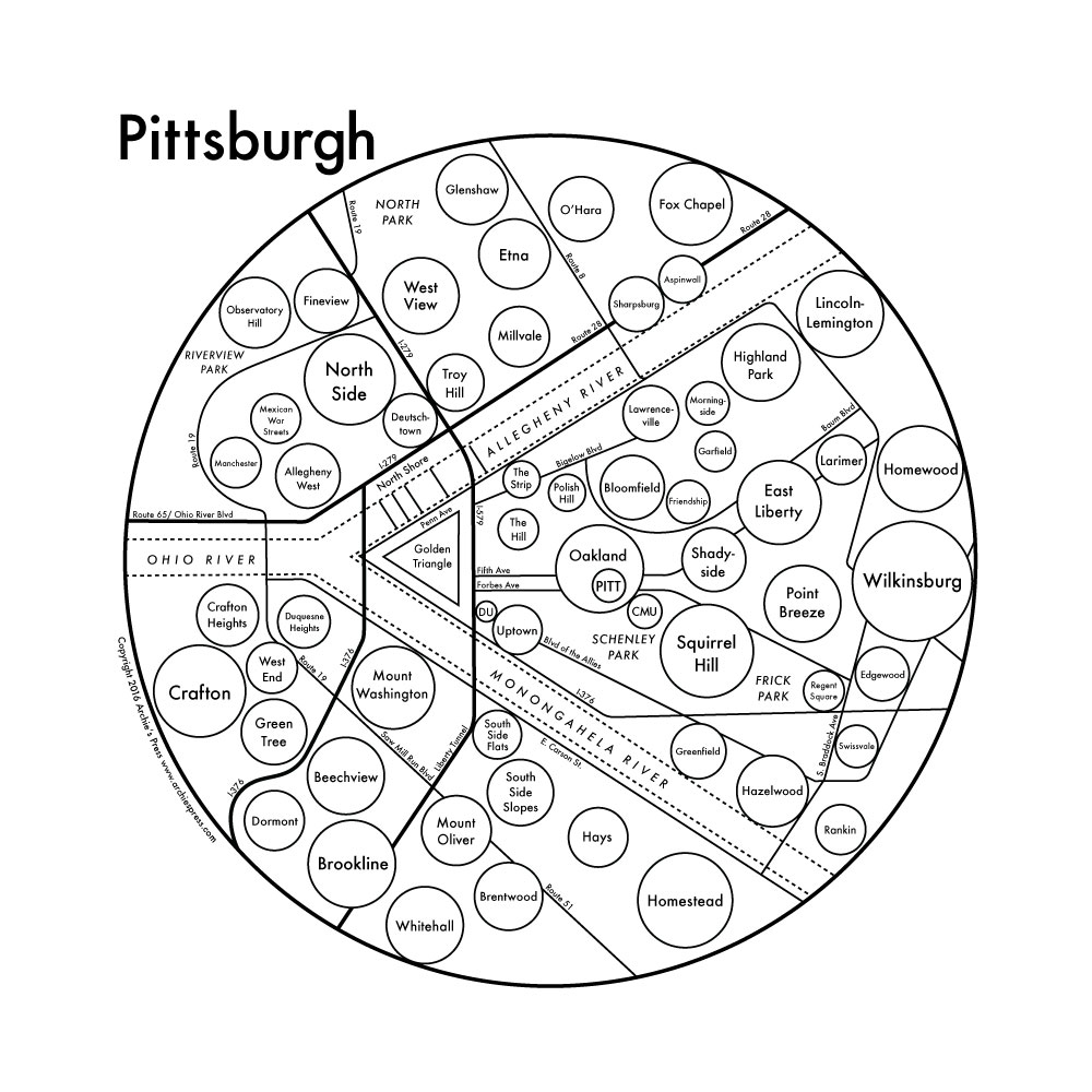
AS: How did you decide where to cut off what fit within the circle? For example, the thinking behind Glenshaw and Fox Chapel, or Dormont and Whitehall—how did you come up with that framing?
AA: I run into this issue for every map I do. It’s really matter of just having to draw the line somewhere. If we’re going to make it simple, it can’t stretch on and on. In a lot of cities, people will include places that are colloquially part of it, even if it’s a separate town. For instance, in Miami, there are so many towns bisecting, perforating, jutting into and out of that city that it’s, like, all a part of “Miami.” So you have to draw the line somewhere, and I let Lena decide where we could draw the line reasonably.
AS: Pittsburgh’s the same as you described Miami, with tons of municipalities around, hugging the City itself.
LT: Yeah! I used to work at Niche.com, a great company, and because we worked with school districts a lot, there were a lot of very defined boundaries of what is a neighborhood, what is a school district. We even had a lot of trouble with cities like Pittsburgh because the boundary that is the technical boundary is [delineated on a map] sitting in the basement of some old lady working in the County Clerk’s office. So it’s all very confusing and hard to get at when you’re doing something digital, like, I need these coordinates to show this is where this ends, or that ends.
Maps are very political in general because you’re drawing lines between in-groups and out-groups.
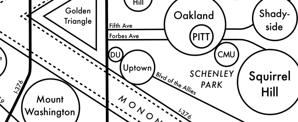
AS: The City of Pittsburgh has ninety neighborhoods, with more municipalities surrounding it, so one of the first thoughts I had when seeing your map was, what is the thought process behind including one neighborhood and not including another neighborhood? Similarly, the size of the circles—how was that determined?
AA: If you think of this idea from [Kevin] Lynch, I’m trying to use a neighborhood as a sort of landmark. The circles aren’t supposed to represent the entire land mass of the place—obviously, not every neighborhood fits inside a circle, and they wouldn’t all fit together—but they do serve as landmarks. When you’re driving through the city, passing different areas, on the left and right, knowing the general areas—I’m trying to get at that, trying to find what the point of reference for that space is.
Neighborhood sizes are notoriously nebulous, so we tried to make them colloquially accurate to their “landmark status”—not applying judgement to them, but finding a sweet spot between their actual size and association within an area. Approaching the central core of the city, the scale changes to reflect each element’s relative significance of presence in the city.
And maybe Pittsburgh is just a problematic subject for this project generally. It was one of the most difficult ones I’ve had, so it’s really exciting to have this conversation with somebody who’s extremely investigative about it. … [But] for all intents and purposes, this map is meant to be like a CliffsNotes for someone who just moved there, and unfortunately, if that included every single thing, it wouldn’t be useful.
AS: One of the other thoughts that struck me when I first saw the map was, man, this needs a little bit of topography. You mentioned the hills and the valleys, but I’m curious: Have you considered topography in the creation of these maps?
AA: It’s really difficult to express topography, even on one of these new fancy Google maps, it will still never read as if you were staring at a hill. Hilly cities aren’t going to make sense unless you’re staring at hills.
AS: I get that your map is aesthetically minimal, with only a few shapes—circles, lines, a triangle—and my assumption is that there would be some kind of compromise aesthetically if you were to add in topographic detail?
AA: I’m working on a bunch of state maps right now: Washington, Oregon, and California. Washington and Oregon have these really nice little strips of mountains, a wall of mountains, and then little roads that snake around the passes to get through them. But California has hills everywhere. So when I try to apply the same topographical features, little dashed circles, it didn’t really translate the same way, and it didn’t look good or feel right. Topo lines kind of work, but to me they just don’t really read right. [Laughs] Pittsburgh was the hardest map I’ve ever done!
LT: I think a lot of the concern was to keep the map consistent, and it wasn’t necessarily lending itself to add a lot of topography. So it was more, how do we keep that consistent with the previous maps. That’s how a lot of decisions were made.
AS: Can you talk a bit about the feedback you’ve gotten from people about this Pittsburgh map specifically?
LT: When I was in Pittsburgh, I was living in the Squirrel Hill area, working on Ellsworth, in Shadyside. Part of Archie’s process for the map was to go through our iterations, and then go to Instagram, where Archie has quite a following of people who are invested in his maps. We put a draft there, got feedback from everyone who’s following his work, to get feedback on Pittsburgh: What should be included, what shouldn’t be included, and how they felt about whether we were capturing everything the way it should be. What was interesting was that—and this was totally a novel experience for me, to be doing something as a designer and then going to social media to get a bunch of people’s opinions on it, and then coming back—it was fascinating and worthwhile for a project like this.
AA: People had been asking for [the Pittsburgh map] for a really long time. One of my good friends in New York is from Pittsburgh and thinks of it as one of the greatest places and talks about it all the time. I’m not really sure if he’s just blowing smoke up my ass, but I feel like he actually does appreciate it a lot—he gave us a lot of feedback. But I’m not even sure most of Pittsburgh has actually seen it, so I don’t really know what they do think. I haven’t been selling it in any stores there or anything, so I think. … It’s happened with a few cities where there’s a little piece of press and then people start freaking about something missing, and then there’s an interesting conversation about how they actually see the city. Bringing up these issues is always sort of exciting.
 AS: I imagine there may be a lot of “you left out my neighborhood!”
LT: Yeah, everyone wanted more neighborhoods; a lot of the Instagram feedback we got was “More neighborhoods! Keep more!” But it just wasn’t graphically possible to get all that information in, or even smaller things. I think Pittsburghers are just so specific to their area, so we got a lot of ultra-specific requests.
AA: Pittsburgh is an interesting city because a lot of people are from Pittsburgh and then leave, and then a lot of people are moving to Pittsburgh, one of those hot new mid-sized cities to live in. So maybe that’s why it’s a difficult one to gauge success, because people are coming at it from both literally not ever turning off their GPS there, or knowing it like the back of their hand and having strong associations with really specific areas. So many reasons this one was hard!