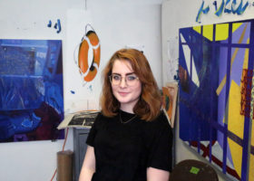
Much of today’s discussion on local art centers on a few topics: sustaining a living as a Pittsburgh-based artist, creating equity in opportunity, energizing a local art market, or fostering critique. Studio Visit is a series intending to contribute to this discussion by spending time in-studio with artists, their work, and their thoughts on a creative life.
![]()
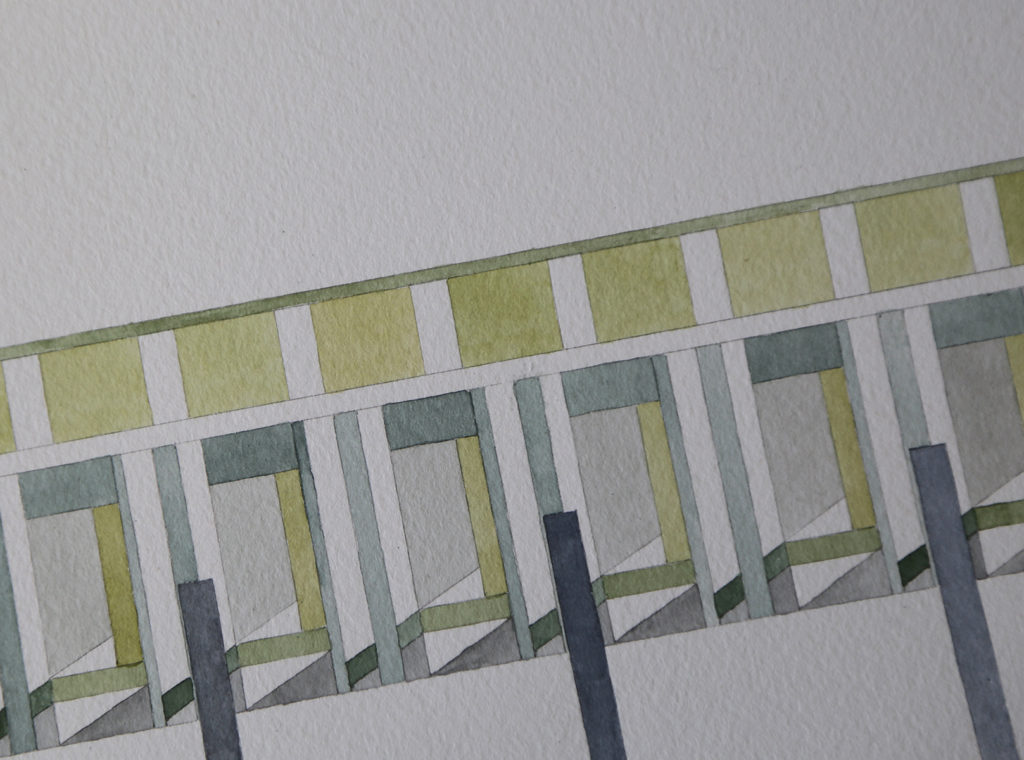
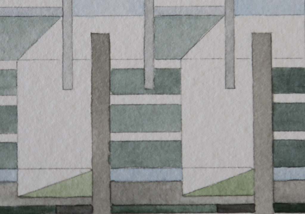
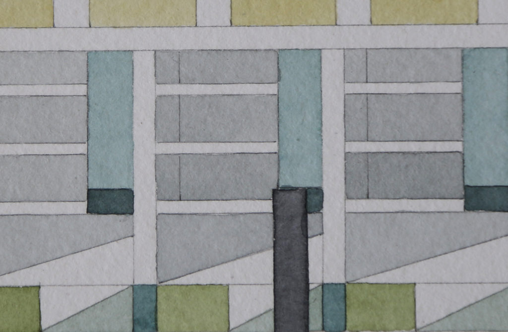
Kara Skylling‘s graphite and watercolor drawings live in a world of architecture fragmented and made skeletal. Certain elements are extracted, distilled, and multiplied, while other shapes are left vacant. Colors—often soft grays, blues and greens— remain muted. Skylling’s stringent structures, partly drawn from the blockiness of Brutalist and Minimalist architectural design, are betrayed by a strong human quality that is evident in the variations of color saturation and minute deviations in pencil line. The works are mesmerizing: Once you identify the pattern, your next step becomes analyzing each line and paint dab, looking for the mark of the artist.
This Saturday, Skylling joins artists Jeremy Tarr and Robert Weaver for the Non-Material Effects of Material Processes exhibit at UnSmoke Systems, June 9 at 6pm.
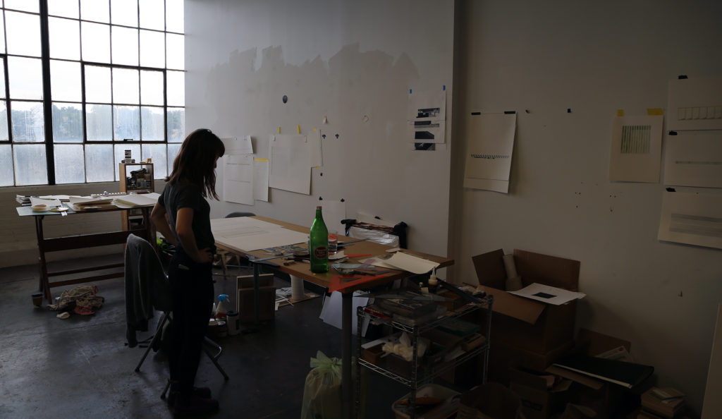
I dropped by Skylling’s studio [Ed. note: David Bernabo and Skylling share a studio space] as she completed the remaining pieces for the show. Given the deadline for completing and framing work, I focused less on talking and more on photographing.
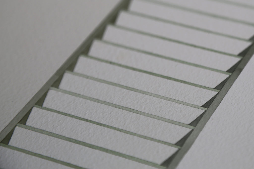
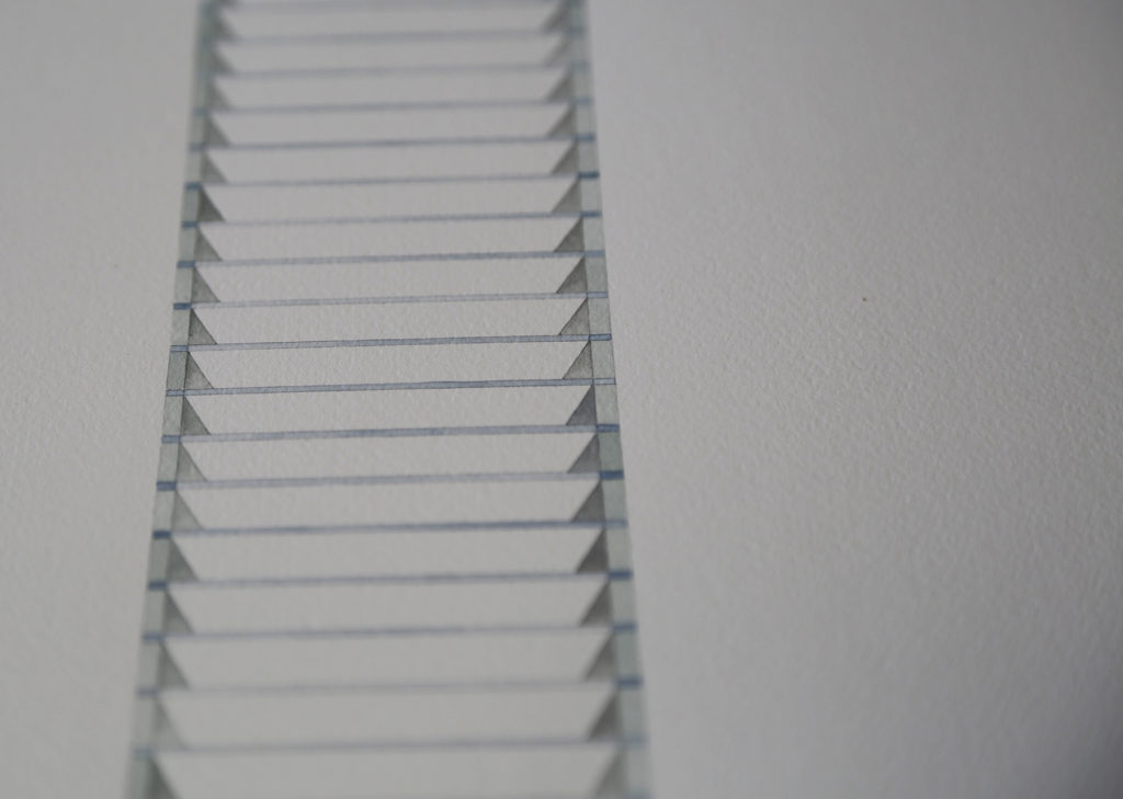
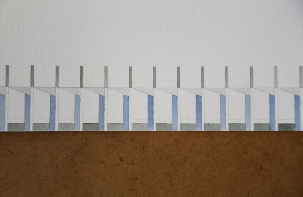
Skylling, who received her BFA from Temple University’s Tyler School of Art, is influenced by interaction with place, movement through space, and engagement with environment. Her work explores pattern and process found in urban landscapes and architecture, but despite the strict systems at work in her pieces, the byproducts often take a wonderfully abstract shape as the watercolor paints bleed into one another on small slabs of plexiglass.
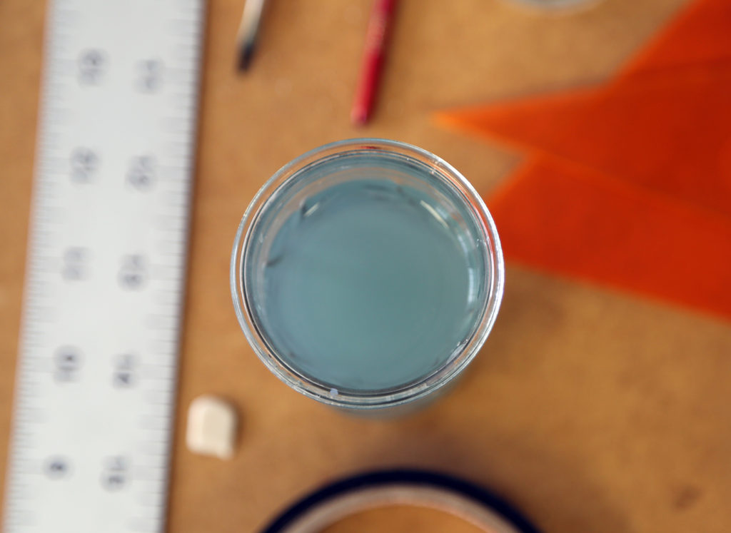
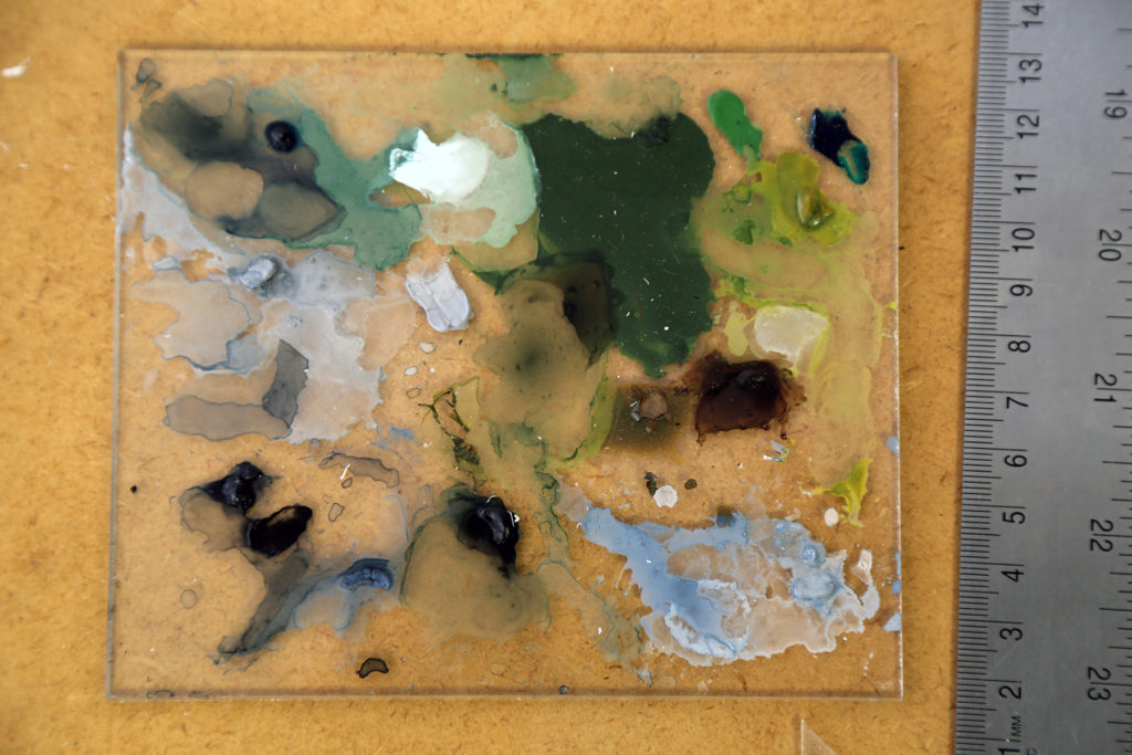
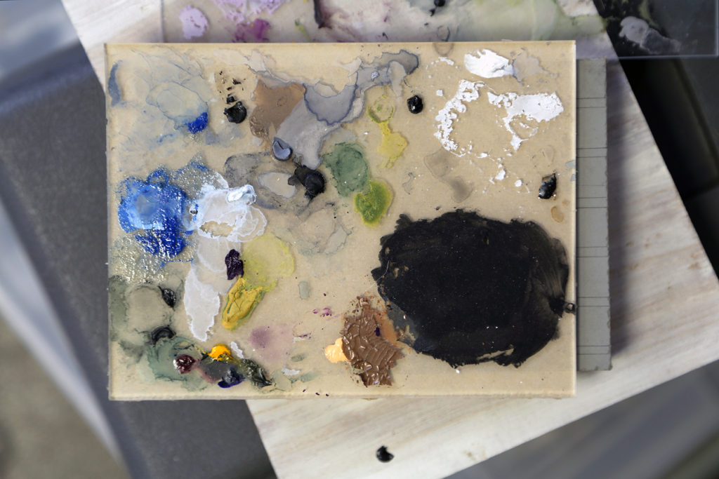
Much of Skylling’s work depends on strict adherence to pattern, but that pattern has been turning more complex recently. Her Street View series from 2013 depicted building outlines filled completely with strips of watercolor and collaged materials. In 2014, her Pile and Stack series introduced ample amounts of negative space, shifting focus from the filling to advanced, hollow structural patterns. Earlier this year, her Vertical Facade Studies series and the beautiful Being In series, exhibited at The Union Hall gallery, experimented with flattened structures—possibly taking inspiration from window blinds, shutters, and elevator shafts. Often the structures were minimized to the point of near abstraction.
Building on the past year’s work, Skylling shows more (literal) depth, pairing 2-D and 3-D vantage points. In a few pieces, excerpted below, Skylling also uses a relative wealth of colors to convey that depth.
